Table of Contents
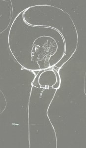
TRG head bubbles
… blur the vision of the physical reality and 'scoop' structured light and graphics in what would otherwise be seen as empty space. they encourage the participants to rely on their touch and hearing to grasp the tangible structures, while their vision is drowned in the impressions of the transient reality…
Requirements:
- light and comfortable
- stable
- must capture as much as possible of the projected image (colour, shape, brightness, contrast, texture…)
- participants should not see the lens of the projector and its glare
- the viewing area should be as smooth and seamless as possible
- the distance between the head and the viewing are should be as big as possible, without making the structure unstable
- avoid 'TV on head' syndrome
- should be immersive (feeling as if you are digging through a space that is 'thick' with visuals), but it can let some of the light through from the physical space (so you can see vague contours, changes in light/darkness…)
prototype 01 "the caravan" (clear pvc with kite rods, prototyping shape only)
- stable structure, with resting points on the waist
- wide viewing area
- viewing - too much 'TV-like'
- difficult to lay down
prototype 02 "the ball" (inflatable tyvek, prototyping shape only)
- immersive experience (can't see anything of the body)
- too many seams
- viewing area and distance too small
- shape overall small and unstable
prototype 03 "the thin face" (tyvek with kite rods, prototyping shape only)
- good viewing distance
- claustrophobic due to cut-off peripheral vision
- not enough support structure to hold it in place
prototype 04 "the elephant" (anthraciet retro projection screen with kite rods, prototyping shape and material)
- material perfect for capturing the projected image
- material absolutely unfit for wearing longer than 5 minutes (too heavy, not breathable, stinky)
- shape unable to be tensed, too big and heavy
Prototype 05 "the hollow-face" (tensile structure using silky fabric and kite rods, prototyping shape and material)
Material
Note: the material used in the prototype (m1) is similar to the proposed material (m2), that was tested only as a sheet in front of the head of the testers. )
- m1 material very light, breathable and comfortable, but too shiny to use in the final head-bubbles
- m2 material is acceptably capturing the projected image, but lets too much lens-glare through (from the projector and other light sources). we tried doubling up the material and found that 4 layers don't have this problem (but the image is completely lost) - therefore we should try to find a fabric that is app. 4x thicker than both material m1 and m2.
- the nice thing about both materials is that it is still possible to recognize light sources that are not directly shining the 'head'
- the kite rods seem to be a bit too fragile (they can snap easily) - maybe the polycarbonate strips could do the trick better (they are quite sturdy, but a bit more flexible (however - this might provide a problem with holding the tension). another good thing about the polycarb. is that its transparent - the current rods make an ugly break in the projected image.
Shape
- much better than the previous prototypes: the viewing area improved, the shape is lighter and has less seams, easy to walk and lay down
- if possible, the viewing area should be slightly bigger (the seams+rods on the sides of the face) disrupt the image quite a bit. making this part bigger makes it more difficult to tense the fabric in a smooth way (without creases and folds)
- the shape as it is is too unstable - straps underneath arms will be made to improve this)
- do we need different sizes for children, or is the structure light enough so we can use the same 'heads' for all sizes?


